
May 12, 20216 min read
How to visualize Airtable data with Chartbrew
Learn how to visualize Airtable data with Chartbrew. Create KPIs and other Airtable charts using Chartbrew's extended set of features.
tutorialintegration
Tutorials, product updates, and reporting guides for connecting your data to Chartbrew and building clear client-facing dashboards.
Page 5 of 6
Learn how to visualize Airtable data with Chartbrew. Create KPIs and other Airtable charts using Chartbrew's extended set of features.

Connect, query, and visualize your Firestore data with Chartbrew. A step-by-step tutorial on how you can start creating your insightful dashboard.

In this tutorial, we are going to connect Simple Analytics' API, get different datasets, and create a dashboard in Chartbrew to show all this data.

Supabase.io makes it easy to create your database. In this tutorial, we will go through visualizing this data with Chartbrew just as easily.

In this tutorial, we are going to learn how to visualize the data stored with Strapi. For the visualization, we are going to use Chartbrew, an open-source visualization platform.

Revenue data contains some of the most important KPIs for businesses. Chartbrew supports Stripe API connections allowing everyone to visualize their Stripe data. This post will show you how to connect to the API and what data you can pull from Stripe.
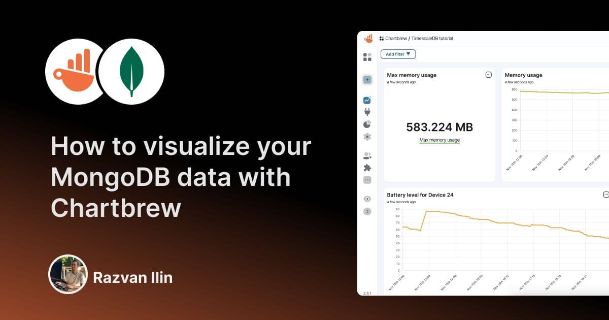
Chartbrew is an open source visualization platform where you can pull data from different sources and create insightful dashboards. With Chartbrew you can connect to your MongoDB database and create charts that tell you more about your data.
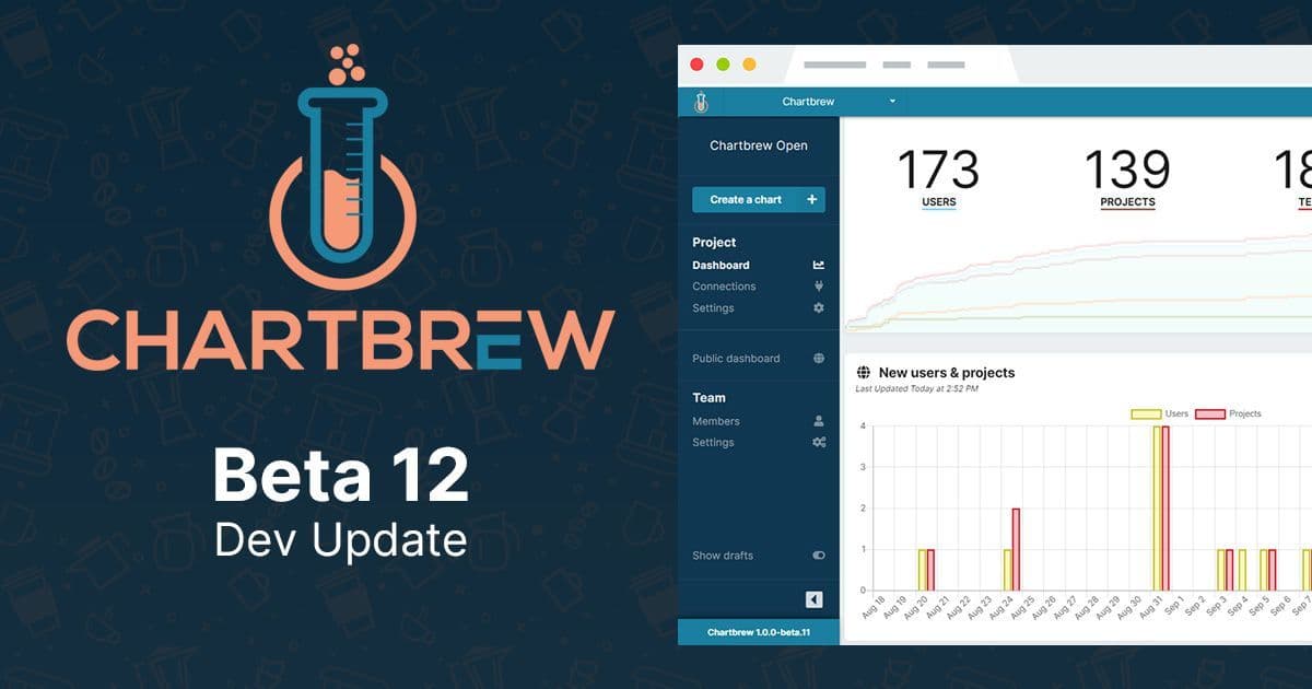
New KPI chart modes and easier deployment with Docker as part of Chartbrew Beta 12. Easier than ever to take Chartbrew for a spin ?.
Ready to start
Connect your data, build live dashboards, and give your team one place to check the numbers that matter.
